REGISTRO DOI:10.5281/zenodo.10198476
¹Amanda Cativo Sena
²Sandra Silva Farias
³Jean Mark Lobo de Oliveira
4Pablo Augusto da Paz Elleres
ABSTRACT
This work aims to contribute to the teaching/learning process of visually impaired people, contextualizing the content of the Human-Computer Interface (HCI) in order to promote the socio-emotional development of these individuals. The main objective is to develop a specific website for the visually impaired, providing information on the subject of HCI. The methodology adopted follows the phases of informal reading, construction and usability testing, according to the development method proposed by Pressman (2011). The results obtained, expressed in reports and graphs, highlight the main difficulties faced by users while using the site. This information was used for the correction and adaptation of the ONE-e site, aligning it with the identified specifications.
Keywords: Human-Computer Interface (HCI), visual impairment, socio-emotional development, usability, website adaptation.
1. INTRODUCTION
In recent decades, the exponential increase in the use of the Internet and the World Wide Web has marked a significant transition to the digital age, providing users with a variety of social interaction interfaces. However, despite this progress, inclusive access to the web for visually impaired people in Brazil remains challenging, representing only 0.74% of adapted systems and websites, according to the survey conducted by the Web for All Movement in partnership with the BigDataCorp platform. Alarmingly, this statistic contrasts with the estimate of approximately 24% of the Brazilian population facing some type of visual impairment, as pointed out by the Brazilian Institute of Geography and Statistics (IBGE) in a survey conducted in 2010.
As highlighted by Nascimento (2012), poor access to the Internet for the visually impaired in Brazil is exacerbated by the scarcity of adequate browsers and the barrier imposed by the structure of the pages, often making it impossible to interact effectively with the information and services available online.
Given this scenario, this paper seeks to answer the following question: “How to build a website that not only offers dynamic content on the Human-Computer Interface (HCI), but also facilitates internet navigation for people with visual impairment?”. The development of the site will be guided by the prioritization of user accessibility, aiming to include and provide autonomy and independence in navigation for those with vision problems. Therefore, this article has as its general objective the creation of a website aimed at the visually impaired, with the purpose of informing about the theme of Human-Computer Interface (HCI). The specific objectives include: I) To identify the nature of users’ problems and difficulties when using websites that are not adaptable to visual impairments; II) Develop a website based on the results of the first evaluation; III) Evaluate the site through HCI techniques, seeking to verify the improvement in the user experience.
2. THEORETICAL FRAMEWORK
In this section, the sub-items that address the concepts and Fundamentals of Web Development, Technologies Used for Web Development will be presented, Database, System Prototype and Related Works.
2.1 FUNDAMENTALS OF WEB DEVELOPMENT
The term “Web Development” can be defined as the building, creating, and maintaining websites on the Internet or on an intranet. Typically, web development involves a client-side, code that interacts with the client through a browser, and a server-side, code that runs on the web server, which encapsulates the application’s business logic and interaction with the database (SANTIAGO et al, 2020).
According to Portilho (2021), the most well-known and used languages for Web Development when it comes to Fornt-End are JavaScript, jQuery, NodeJS and React. The back-end, on the other hand, is located in the “back” of the application, and for this, a variety of server-side languages are used, such as PHP, Ruby, Java or Python (SANTIAGO ET. AL, 2020). The following is a brief historical and conceptual contextualization of the Technologies Used for Web Development.
2.2 TECHNOLOGIES USED FOR WEB DEVELOPMENT
According to Cunha (2015), for a web system to exist, it is necessary for the software to be hosted on a server, responsible for performing all processing and queries to the database through a specific language. On the other hand, for navigation through a browser, it is necessary to use a language called HTML (HyperText Markup Language), a language exclusively for content, without worrying about the formatting of the documents (CASIANO, 2010).
However, HTML requires languages such as PHP (Hypertext PreProcessor). PHP is a server-side programming scripting language embedded in server-side HTML. Similar to PHP, there are other languages that can replace it, such as: Javascript, Python, Ruby, Java, Erlang, TypeScript, among others (FRED JUNIOR, 2000). The following is a brief historical and conceptual contextualization of the System Database.
2.3 DATABASE
A web database is a place where information can be stored. The information can be consulted, changed, deleted, in whole or in part, through an application known as the Database Management System (DBMS), also called simply the Database (DB). (COELHO, 2010) A DBMS is a computerized system that allows the user to create and maintain a database. A general-purpose software that facilitates the process of defining, building, manipulating, and sharing databases among various users and applications (FONSECA, 2020).
Costa (2011) explains that the database approach is considered the best way, because it has the following advantages: Centralized data control:
Data is concentrated in a single location and this provides greater control. In the file processing approach, data is dispersed, as each application maintains its own data files. Control of redundancy, reduction of storage space and data sharing: in conventional file processing there is a waste of storage space, since the same information usually appears in many different files. In the database approach, data is stored only once and can be shared (concurrently or not) by several users. Elimination of inconsistencies and guarantee of integrity: in the traditional, file-based method, given the repetition of stored information, it may happen that the same data presents divergent values. This occurs, for example, when data that is present in two files is updated in only one location. The files are said to be inconsistent as they have different entries for the same data. And if it lacks consistency, there is no integrity (the file has incorrect information). In a database, it is possible to maintain the consistency and integrity of the data. Establishment of standards and ease of access to data: in the database approach, due to the centralization of data, it becomes more conducive to instituting naming and documentation standards. Due to this standardization, information retrieval is more efficient. In the conventional form of storage, data is spread out in files of various formats and the applications that access this data have been written in different programming languages. Data independence: In the file system, the definition of the storage structure and the method of data access is included in the application code. These are called data-dependent, since it is impossible to change the structure of the data files without modifying the respective application program. Databases, however, enable data independence, as they allow data abstraction (COSTA, 2011).
The following is a brief historical and conceptual contextualization of the Systems Prototype.
2.4 PROTOTYPE SYSTEMS
At the level of system development, the prototype can be considered as the first version of a system, it helps users to come up with new ideas for the requirements and thus find the good parts and the bad parts of the system. In the context of cost, prototypes can help to reduce them. This is possible because the user will be involved in all stages of development, thus causing lower costs if the software needs to be adjusted (JESUS, 2011).
Jesus (2011) classifies the prototypes according to fidelity. Low-fidelity prototypes bear little resemblance to the product, do not contain much complexity, are inexpensive and are produced quickly and the model is used at the beginning of projects. High-fidelity prototypes, on the other hand, are developed to market clearer suggestions about the software. They are used for the analysis of more technical issues and clearly define to the customer how the software will be used. The following is a brief historical and conceptual contextualization of the Related Works.
2.5 RELATED WORKS
The following scientific publications show significant results related to this work, namely: Silva (2010) and Naka and Andrade (2014).
2.5.1 NAKA ANDRADE (2014)
The objective of this work was to develop an integrated solution for the visually and hearing impaired through a free hardware and software system. For the author, the difficulties encountered by the hearing impaired are numerous, and for this reason it was necessary to find a solution so that he could help them in their daily tasks.
The materials and methods used were: color recognition sensor and system pinout. To identify the colors, a color recognition module was used coupled to the Arduino system.
The TCS230 – TCS3200 module was chosen for the project because it is programmable and capable of converting visible light into frequency. The module was composed of 64 photodiodes, of which 16 have filters for the color red, 16 for the color green, 16 for the color blue and 16 that do not have any filter.
With the development of the project, it was possible to obtain color recognition for the choice of clothes, to verify if a fruit is properly colored for consumption, among other tasks that involve the use of colors in daily life. The use of vibracall allowed the hearing impaired to be able to feel a short or long vibration signal and also to identify the colors, with this, it was possible through the project to obtain information and provide for two classes of disabilities (visual and auditory).
The total costs involved in the project did not exceed R$100.00 reais, therefore, it is possible to think of large-scale production and make it an accessible product for anyone, even be distributed by research centers that promote the development of projects aimed at people with visual and hearing impairments.
2.5.2 KULPA, TEIXEIRA AND SILVA (2010)
The objective of this work was to prove the contribution of colors in the usability of interfaces, having the disabled person with Low Vision as a user, in addition to proposing a color model that can help the web-designer in the development of interfaces so that they can be better used by these users as well.
The usability test of 3 websites was carried out, conducted in the form of a questionnaire with questions based on usability goals and resulting from the user experience. After the tests, it was also demonstrated the difficulties of adjustment to society that these people experience due to the lack of knowledge and facilities made available specifically to them. The results showed that colors are the visual element that most influences the usability of an interface, proving that colors when used in the construction of a user interface, obeying certain criteria and taking into account the limitations of the Low Vision user, can positively assist in the usability of this interface.
3. MATERIALS AND METHODS
In this section, the following sub-items that make up the system will be presented: adopted methodology, website information, programming language, database and coding.
3.1 METHODOLOGY ADOPTED
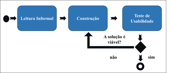
The methodological procedures for the elaboration of this project are based on the software approach presented by Pressmam (2011). The method was divided into four steps, shown in Figure 1.
Figure 1: Methodology Flowchart
Source: Adapted from (Pressmam, 2011).
Informal Reading: in this stage, a bibliographic survey was carried out, the reading of works that are related to this theme, in order to obtain a deep knowledge about the techniques and methodologies for the elaboration of this project. The bibliographic basis was made through websites, books and works published and written in Portuguese in the period from 2012 to 2023.
Construction: At this stage, a website was created aimed at visual PWDs. The construction was based on: requirements documents, database and system modeling.
Usability Testing: In this stage, two usability tests were carried out, the first with the objective of verifying the degree of acceptance of the system and detecting possible usability problems. The second test was carried out with the objective of validating the site by verifying the degree of acceptance, in addition to detecting possible usability problems and applying improvements.
3.2 ONE-E WEBSITE INFORMATION
The developed website is based on information about human-computer interaction and the structure used was the On-Page. The main objective of the site is to inform users about HCI-related issues through articles and videos, as well as to conduct a survey with users about the usability and accessibility of the site for visionary PWDs.
3.3 PROGRAMMING LANGUAGE USED
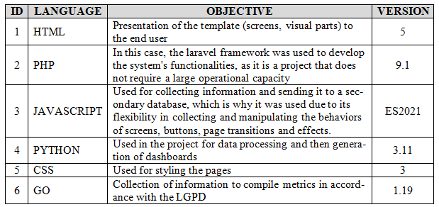
The present work was developed using the WordPress that Provides an environment for editing code with support for the script, JavaScript , PHP and other programming languages. Table 1 shows the programming languages that were used to build the system.
Table 1: Languages used in the development of the website
Source: Authors (2023).
The site has its structure in HTML because it is web and was built and adapted to present a responsive layout. Thus, the bootstrap framework was used because it has broad characteristics typical of current mobile devices. Bootstrap is designed to adapt screens on various devices, providing a vast library of components that allow applications and development in the various languages and web design techniques available (MIGUEL AND COSTA, 2015).
JavaScripth was used for the manipulation and control of actions that provide characteristics of the object-oriented paradigm. It treats its basic structures, browser properties, and the elements of an HTML page as objects (entities with properties and behaviors) and allows them to be manipulated through programmable user events, operators, and expressions. JavaScript offers interactive features that HTML lacks and allows the creation of interactive and dynamic pages, which are interpreted locally by the browser, without having to resort to remote execution of programs on the server (ROCHA, 1999).
The Pyton programming language was used for data analysis and dashboard creation. Dashboard is a visual indicator with dashboards that show more significant information to achieve goals. The primordial type offers information to monitor the most important indicators, using tables and graphs, according to the definition of the indicators. Another well-known type, on the other hand, presents information in the form of graphs and tables that are interspersed for the purpose of data analysis (BORGES ET AL., 2020).
The GO language was used to collect metrics and the standard CSS was used to adjust the site’s styling.
3.4 DATABASE
For the database, Mysql was used because it is a free and open source database, an account was created and then the default configurations. In the construction, the tables were mapped according to the requirements raised and information needed to feed the secondary base for generating information from the dashboards. The database was chosen among others because it is a manager that, despite being free, offers many advantages for the various types of applications such as: applications for mobile devices, product catalogs, content management and reduction of the time between the initial failure and recovery. Xampp was used for the local test server because it is free software and because the developers have greater familiarity and knowledge about it.
3.5 SYSTEM PROTOTYPE
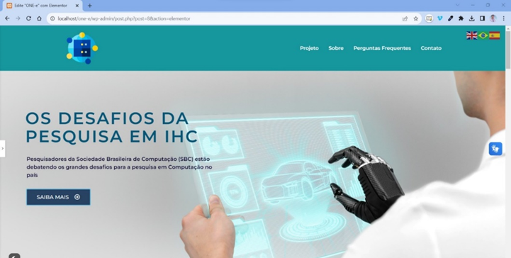
The developed website is based on information about human-computer interaction. The main purpose of the site is to inform people who are interested in the subject, in addition to conducting a survey with users about the usability and accessibility of the site for people with visual impairments. The ONE-e site has only one ordinary user. Figure 1 illustrates the main page of the site, where an informative article and options about the project and developers are available.
Figure 1: Informational Site Screen
Source: Authors (2023)
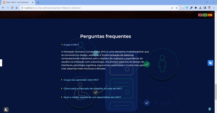
Figure 2 illustrates the tab where the most frequently asked questions about HCI and their respective answers are listed.
Figure 2: Website Screen Frequently Asked Questions
Source: Authors (2023).
In addition to this information, the site consists of button links, such as project, about, frequently asked questions and contacts. The project link directs the user to a part of the site that describes a title “Learn a little about Human-Computer Interaction”, in addition to having a button that allows you to change the color of the site, and a button that directs to videos on youtube about HCI.
The “about us” link takes the user to a part of the site that has a detailed description of the site’s creators. The “contact” link forwards a page where the authors’ contact information is located on Facebook, Twitter, Likedin, Telegram, Spotify and Youtub, as well as a link that allows the user to go to the usability test questionnaire.
In all of these parts of the page, a button is available that changes the color of the main bar of the code. A button is also available for translating texts into Brazilian Sign Language by means of an avatar.
3.6 SOURCE CODE
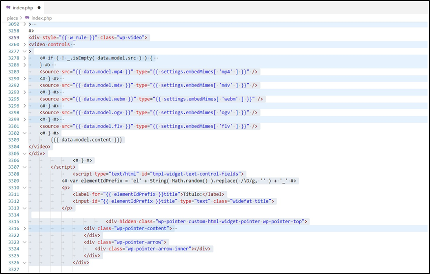
Part of the html and php code are illustrated in Figure 3, and refer to the structure used on the site, and the model adopted is based on the on-page optimization strategy, also known as on-page SEO. It is characterized by the process of optimizing specific elements on a web page, to improve visibility in search engines and provide a better user experience. This is critical to the success of a website, as search engines such as Google evaluate the quality and relevance of pages when ranking them in search results.
Figure 3 – Source Code
Source: Authors (2023)
In summary, on-page formatting is essential for improving search engine visibility, attracting advanced traffic, and providing a better user experience. The sections of the page with content were created aiming at keywords and relevant as well as a well-organized structure, thus seeking to improve navigation and enable better engagement and satisfaction of visitors.
4. USABILITY TESTING
In this section, the following sub-items that make up usability testing will be presented, as well as the results and discussions.
4.1 USABILITY TESTING
The focus of the usability test was to improve the user experience in using the site, in order to facilitate navigation for users with high and low vision.
For this stage, the guidelines of the ISO 9241/11 standard were followed, which designates the procedures for carrying out HCI evaluations and tests. Table 2 shows the planning steps.
Table 2 – Planning Steps
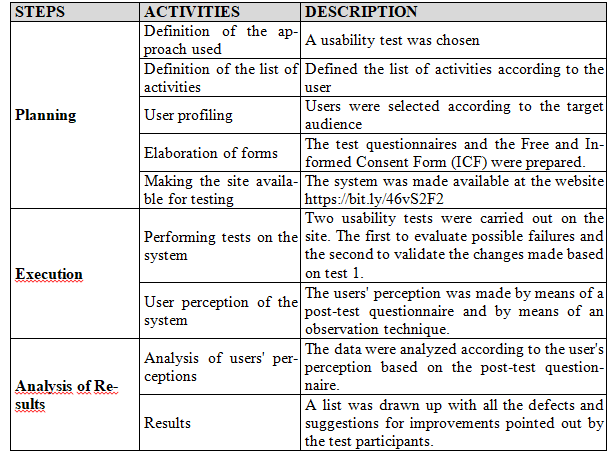
Source: Adapted from Brown Et. al (2013).
4.1.1 PLANNING
The objective of the test according to ISO 9126 was to evaluate the usability of a website, with the purpose of verifying the user’s interaction with it. Thirty-four (34) participants were selected for the first test and 44 (forty-four) participants for the second usability test, including adults over 18 years of age and who had some degree of visual impairment.
In the planning, it was decided to use usability testing, as it is a more appropriate method for the occasion. At this stage, the informed consent form, the List of Activities that were carried out in the System and the Post-Evaluation Questionnaire were prepared. Table 3 presents the informed consent form and its guidelines.
Table 3 – Free and Informed Consent Form

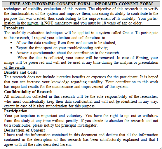
Source: Authors (2023)
Exhibit 4 presents the site’s Task List for users to complete.
Table 4 – Task List
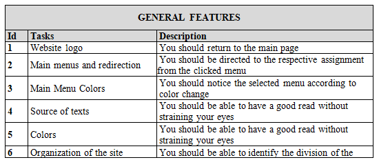
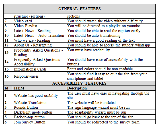
Source: Authors (2023).
Chart 5 presents the user’s perception of ease of use and performance in the use of the system, in which they describe their degree of agreement with the following statements.
Table 5 – Ease of use and performance questionnaire
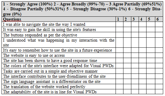

Source: Authors (2023)
The usability test was carried out individually by each participant who answered the questionnaires available in google forms available at the https://forms.gle/GiAPYXnsuuRNAvoU7 website. The questionnaires were answered after each of the participants used the website at this stage of the research.
The usability test was carried out individually by each participant who answered the questionnaires available in google forms available at the https://forms.gle/GiAPYXnsuuRNAvoU7 website. The questionnaires were answered after each of the participants used the website at this stage of the research.
4.2 Results and Discussions
In the first test, 34 employees participated and in the second test, 44 employees who best fit the research profile participated. Initially, 100% of the participants agreed with the terms described in the informed consent form and completed the survey. Graph 1 illustrates the results.
Graph 1: Percentage of agreement with the informed consent form
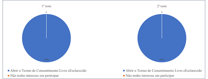
Source: Authors (2023)
Graph 2 illustrates the results of the participants who consented to participate in the research.
Graph 2: Consent Percentage

Source: Authors (2023).
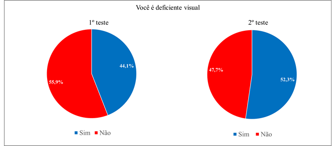
The number of participants who had some type of visual impairment was identified, as well as participants who did not have any type of visual impairment. Graph 3 illustrates the results.
Graph 3: Identification of Disabled and Non-Disabled Participants
Source: Authors (2023)
In the first test, 34 employees participated, of which 55.9% did not have any type of visual impairment and 44.1% were visually impaired. In the second test, 44 employees participated, of which 47.7% did not have any type of visual impairment and 52.3% were visually impaired.
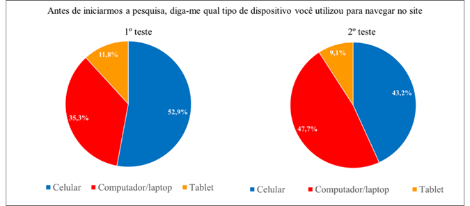
The device for accessing the site has been identified. Graph 4 illustrates the results.
Graph 4: Access Device
Source: Authors (2023)
In the first test, 34 employees participated, of which 52.9% accessed the site from cell phones, 35.3% from a computer/laptop and 11.8% from a tablet. In the second test, 44 employees participated, of which 43.2% accessed from cell phones, 47.7% from computer/laptop and 9.1% from tablet. Based on these data, the highest number of accesses in the first usability test was through cell phones, and in the second usability test, the highest number of accesses was through a computer/laptop.
Regarding ease of navigation, Graph 5 illustrates the results.
Chart 5: Access Device

Source: Authors (2023)
In the first test, 26.4% strongly agreed, 47% broadly agreed, 20.6% partially agreed, 2.9% partially disagreed, and 2.9% strongly disagreed. In the second test, 22.7% strongly agreed, 72.7% broadly agreed, and 4.5%. According to the data, it can be concluded that in the second test there were no negative answers, and there were 100% of positive answers compared to the first test, which had a total of 94% of positive answers, and a total of 5.8% of negative answers.
Regarding ease of use, Graph 6 illustrates the results.
Graph 6: Access Device

Source: Authors (2023)
In the first test, 26.4% strongly agreed, 35% broadly agreed, 35.2% partially agreed, and 2.9% strongly disagreed. In the second test, 27.3% strongly agreed, 59.1% broadly agreed, and 13.6% partially agreed. According to the data, it can be concluded that in the second test there were no negative answers, and there were 100% of positive answers compared to the first test, which had a total of 96.6% of positive answers and 2.9% of negative answers.
Regarding the action of the buttons, Graph 7 illustrates the results.
Graph 7: Button Action

Source: Authors (2023)
In the first test, 17.6% strongly agreed, 38.2% broadly agreed, 32.3% partially agreed, 6% partially disagreed, 2.9% strongly disagreed, and 2.9% strongly disagreed. In the second test, 34.1% strongly agreed, 47.7% broadly agreed, and 18.2% partially agreed. According to the data, it can be concluded that in the second test there were no negative answers, and there were 100% of positive responses compared to the first test, which had a total of 88.1% of positive responses and 11.8% of negative responses.
Regarding the interaction of the site with the user, Graph 8 illustrates the results.
Graph 8: Site Interaction

Source: Authors (2023)
In the first test, 14.7% strongly agreed, 50% broadly agreed, 29.4% partially agreed, 2.9% partially disagreed, and 2.9% strongly disagreed. In the second test, 22.7% strongly agreed, 72.7% broadly agreed, and 4.5% partially agreed. According to the data, it can be concluded that in the second test there were no negative answers, and there were 100% of positive answers in relation to the first test, which had a total of 94.1% of positive answers and 5.8% of negative answers.
Regarding the ease of remembering, Graph 9 illustrates the results.
Graph 9: Ease of Remembering

Source: Authors (2023)
In the first test, 17.6% strongly agreed, 47.1% broadly agreed, 29.4% partially agreed, 2.9% partially disagreed, and 2.9% strongly disagreed. In the second test, 29.5% strongly agreed, 63.6% broadly agreed, and 6.8% partially agreed. According to the data, it can be concluded that in the second test there were no negative answers, and there were 100% of positive answers in relation to the first test, which had a total of 94.1% of positive answers and 5.8% of negative answers.
Regarding ease of use and access, Graph 10 illustrates the results.
Graph 10: Ease of Use and Access

Source: Authors (2023)
In the first test, 26.5% strongly agreed, 26.5% broadly agreed, 35.3% partially agreed, 5.9% partially disagreed, 2.9% strongly disagreed, and 2.9% strongly disagreed. In the second test, 29.5% strongly agreed, 63.6% broadly agreed, and 6.8% partially agreed. According to the data, it can be concluded that in the second test there were no negative answers, and there were 100% of positive answers compared to the first test, which had a total of 88.3% of positive answers and 11.7% of negative answers.
Regarding response time, Graph 11 illustrates the results.
Graph 11: Response Time

Source: Authors (2023)
In the first test, 17.6% strongly agreed, 50% broadly agreed, 29.4% partially agreed, and 2.9% strongly disagreed. In the second test, 29.5% strongly agreed, 68.2% broadly agreed, and 2.3% partially agreed. According to the data, it can be concluded that in the second test there were no negative answers, and there were 100% of positive answers compared to the first test, which had a total of 97% of positive answers and 2.9% of negative answers.
Regarding the color of the interface, Graph 12 illustrates the results.
Graph 12: Interface Color

Source: Authors (2023)
In the first test, 17.6% strongly agreed, 47.1% broadly agreed, 26.5% partially agreed, 2.9% partially disagreed, 2.9% strongly disagreed, and 2.9% strongly disagreed. In the second test, 29.5% strongly agreed, 68.2% broadly agreed, and 2.3% partially agreed. According to the data, it can be concluded that in the second test there were no negative answers, and there were 100% of positive answers compared to the first test, which had a total of 91.2% of positive answers and 8.7% of negative answers.
Regarding the complexity of the tasks, Graph 13 illustrates the results.
Graph 13: Task Complexity

Source: Authors (2023)
In the first test, 17.6% strongly agreed, 50% broadly agreed, 29.4% partially agreed, and 2.9% strongly disagreed. In the second test, 29.5% strongly agreed, 68.2% broadly agreed, and 2.3% partially agreed. According to the data, it can be concluded that in the second test there were no negative answers, and there were 100% of positive answers compared to the first test, which had a total of 97% of positive answers and 2.9% of negative answers.
Regarding the contribution to ease of use, Graph 14 illustrates the results.
Graph 14: Contribution to Ease of Use

Source: Authors (2023)
In the first test, 11.8% strongly agreed, 58.8% broadly agreed, 20.6% partially agreed, 5.9% strongly disagreed, and 2.9% strongly disagreed. In the second test, 29.5% strongly agreed, 65.9% broadly agreed, and 4.5% partially agreed. According to the data, it can be concluded that in the second test there were no negative answers, and there were 100% of positive answers compared to the first test, which had a total of 91.2% of positive answers and 8.8% of negative answers.
Regarding the sign language assistant, Graph 15 illustrates the results.
Graph 15: Sign Language Assistant

Source: Authors (2023)
In the first test, 35.3% strongly agreed, 47.1% broadly agreed, 11.8% partially agreed, 2.9 partially disagreed, and 2.9% strongly disagreed. In the second test, 22.7% strongly agreed, 75% broadly agreed, and 2.3% partially agreed. According to the data, it can be concluded that in the second test there were no negative answers, and there were 100% of positive answers compared to the first test, which had a total of 94.2% of positive answers and 5.8% of negative answers.
Regarding the translation of the site, Graph 16 illustrates the results.
Graph 16: Site Translation

Source: Authors (2023)
In the first test, 32.4% strongly agreed, 58.8% broadly agreed, 5.9% partially agreed, and 2.9% strongly disagreed. In the second test, 29.5% strongly agreed, 68.2% broadly agreed, and 2.3% partially agreed. According to the data, it can be concluded that in the second test there were no negative answers, and there were 100% of positive answers compared to the first test, which had a total of 97.1% of positive answers and 2.9% of negative answers.
Regarding the adaptation to the site, Graph 17 illustrates the results.
Graph 17: Adaptation to the Site

Source: Authors (2023)
In the first test, 11.8% strongly agreed, 50% broadly agreed, 23.5% partially agreed, 2.9% partially disagreed, 8.8% strongly disagreed, and 2.9% strongly disagreed. In the second test, 27.3% strongly agreed, 72.7% broadly agreed. According to the data, it can be concluded that in the second test there were no negative answers, and there were 100% of positive answers compared to the first test, which had a total of 85.3% of positive answers and 14.6% of negative answers.
Regarding font size, Graph 18 illustrates the results.
Graph 18: Font Size

Source: Authors (2023)
In the first test, 17.6% strongly agreed, 44.1% broadly agreed, 11.8% partially agreed, 5.9% partially disagreed, 8.8% strongly disagreed, and 11.8% strongly disagreed. In the second test, 27.3% strongly agreed, 68.2% broadly agreed, and 4.5% strongly agreed. According to the data, it can be concluded that in the second test there were no negative answers, and there were 100% of positive answers compared to the first test, which had a total of 73.5% of positive answers and 26.5% of negative answers. In the first test, the highest level of negativity was identified in relation to the other questions.
Regarding the responsiveness of the site, Graph 19 illustrates the results.
Graph 19: Font Size

Source: Authors (2023)
In the first test, 35.3% strongly agreed, 55.9% broadly agreed, 5.9% partially agreed, and 2.9% strongly disagreed. In the second test, 27.3% strongly agreed and 72.7% broadly agreed. According to the data, it can be concluded that in the second test there were no negative answers, and there were 100% of positive answers compared to the first test, which had a total of 97.1% of positive answers and 2.9% of negative answers.
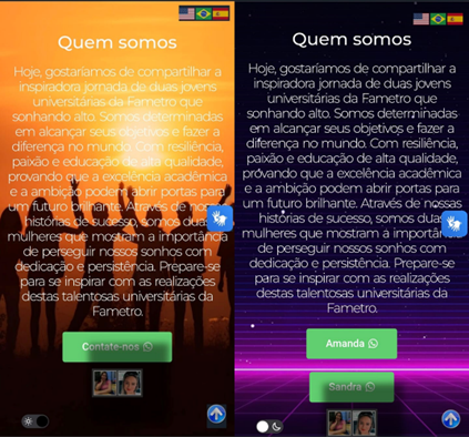
Based on the analysis of the graphs, it was identified that the question that had the most negative results was related to the colors of the interface and the font, which resulted in a rate of 26.5% of negative responses. It can also be identified in the reviews that users left in the first usability test.
The first review reported the following: “I still need to change the color of the texts, because I was able to read them, but with difficulties.” Another user described “Improve the interface. I had a hard time reading some texts because some texts were not clearly visible.”
For these issues, the color of the fonts, the background images, as well as the smoothing of the cards for better visualization have been changed. Figure 4 illustrates part of the site that illustrates version 1.0 of the site and version 1.2 of the site after changes made according to the criticisms of the first usability test.
Figure 4: About Us tab of the ONE-e Site in Version 1.0 and 1.2
Source: Authors (2023)
In addition to these changes, the responsiveness of the site has also been improved so that it can be accessed by more types of devices, and the structures have been changed to improve the performance of the site in light and dark mode.
5. FINAL CONSIDERATIONS
As presented and discussed in this work, the ONE-e website presents benefits that help in people’s daily lives, whether they are visually impaired or people who do not have any type of visual difficulty. Among these benefits, a higher quality of life, greater comfort, safety, convenience and, above all, agility for users were identified.
In this sense, the objective of this work was to develop a website aimed at the visually impaired to enable information on the theme of Human-Computer Interface (HCI). To achieve this objective, a literature review was first carried out to identify the project’s methodology and HCI techniques. Later, a website was created for the visually impaired.
Then the first usability test was done and it was found that there were improvements to be made on the site, and based on the suggestions and criticisms made by the users, the second version was created which was validated by the second usability test that positively evidenced the improvements adopted. Thus, we can conclude that the first usability test resulted in the identification of requirements for the improvement of the site in the second version. And based on the second usability test, the site was accepted by users who agreed with its practicality, ease of use, comfort, safety and usefulness.
REFERENCES
Almeida, K. P. (2010). ERP Software Quality Assessment According to ISO/IEC 9126 Standard. 101. Lavras MG. Source: http://repositorio.ufla.br/bitstream/1/5180/1/MONOGRAFIA_Avaliacao_da_qualidade_de_software_ERP_de_acordo_com_a_norma_ISO-IEC_9126.pdf
Almeida, M. R., Maesta, D., Lima, F., & Pontes, W. (2017). Color Identification System for the Visually and Hearing Impaired. 10. Source: https://www.conic-semesp.org.br/anais/files/2017/1000025853.pdf Bazzi, C. L. (2013). Introduction to Database. 90. Curitiba. Source: https://proedu.rnp.br/bitstream/handle/123456789/1550/Introducao_banco_dados_ISBN.pdf?sequence=1&isAllowed=y Bozi, F., & Arrevabeni, M. (2019). Use of Assistive Technologies in the Teaching-Learning Process of Students with Visual Impairment. Ifes Science, 71-86.
Brown, M. S., Harding, S., Parker, J., Bearman, C., Maguire, N., Forrest, M., . . . Jackson, M. (Nov de 2013). Usability of Geographic Information: Current challenges and future directions, Applied Ergonomics. 44, 855-865.
Caldeira, C. P. (2015). Introduction to HTML. 48. Evora. Source: https://dspace.uevora.pt/rdpc/bitstream/10174/13240/1/Introdu%C3%A7%C3%A3o%20ao%20HTML.pdf Casiano, R. T. (2010). Standards for Web Development. 90. American SP. Source: http://ric.cps.sp.gov.br/bitstream/123456789/1704/1/20102S_CASSIANORodrigoTuratti_TCCPD1079.pdf Coelho, J. (2011). Introduction to Database. Open University, 35. Source: https://repositorioaberto.uab.pt/bitstream/10400.2/3462/1/Introdu%C3%A7%C3%A3o%20%C3%A0%20Base%20de%20Dados.pdf Costa, E. R. (2011). Relational Databases. 64. São Paulo, SP.
Costa, R. X., & Coutinho , V. (Jan/Mar 2018). Between Colors and People with Low Vision. Universidade Federal da Paraíba, 14, 1, 27. Source: file:///C:/Users/Ruth/Downloads/9961-Texto%20do%20artigo-37868-1-10-20180104.pdf Cunha, F. (2015). Web System: what is it and how does it work? Accessed Sept. 16, 2023, available at https://www.mestresdaweb.com.br/tecnologias/sistema-web-o-que-e-e-como-funciona Fonseca, G. H. (Mar 2020). Database Fundamentals. 35. Source: http://professor.ufop.br/sites/default/files/george/files/2020-2_apostila_cdd003.pdf Fred Junior, C. (2000). Programming for Web with PHP/MySQL. 65. Source: http://www.montesclaros.mg.gov.br/downloads/php/phpmanual.pdf Galilean. (May 23, 2020). Galileo Digital Magazine. Technology. Accessed Sep 27, 2023, available at https://revistagalileu.globo.com/Tecnologia/noticia/2020/05/apenas-074-dos-sites-brasileiros-sao-acessiveis-pessoas-com-deficiencia.html Gevehr, D. l., & Portal, V. (2019). Digital Communication and Social Interaction among Youth: the use of audiovisual materials in social networks. 14. Source: https://periodicos.uff.br/pragmatizes/article/view/28220/23271 IBGE. (2023). Data Reaffirms the Rights of Visually Impaired Persons. Source: http://portal.mec.gov.br/component/tags/tag/deficiencia-visual IBGE, I. B. (2023). People with Disabilities. Accessed on August 31, 2023, available on https://educa.ibge.gov.br/jovens/conheca-o-brasil/populacao/20551-pessoas-com-deficiencia.html Iuliano, H. G. (2014). Software Metrics and Quality Management. Centro Paula Souza, 49. Americana SP. Source: https://ric.cps.sp.gov.br/bitstream/123456789/577/1/20142S_IULIANOHugoGiovanni_CD1945.pdf Jesus, D. d. (2011). Software for Prototyping Desktop Interfaces. 78. Slab. Source: https://www.univates.br/bduserver/api/core/bitstreams/ce42ff68-be0c-4c46-977b-9fd551b47adc/content Kulpa, C. C., Teixeira, F., & Silva, R. (2010). A Color Model in the Usability of Computational Interfaces. Design & Technology, 13. Source: https://lume.ufrgs.br/bitstream/handle/10183/26372/000743978.pdf?
Luiz Junior, A. Z., & Vidal, A. G. (2005). Construction of Information Systems Construction of information systems. 13. Source: https://www.revistas.usp.br/rausp/article/view/44402/48022 Machado, M. P., & Souza, S. (2010). Software Quality and Metrics. Department of Informatics – Federal University of Espírito Santo, 18. Source: https://mmpsw.files.wordpress.com/2010/04/aula-12-qualidade-sw.pdf Morcelli, R. D., & Seabra, R. (2014). Digital Inclusion and Visual Impairment: Analysis of the Use of Internet Communication Tools. INFORMATICS IN EDUCATION: theory & practice, 20. Source: https://seer.ufrgs.br/index.php/InfEducTeoriaPratica/article/view/42852/29981 Naka, P. Y., & Andrade, M. (2014). Inclusive Design: Independence for the Visually Impaired. 117. Apucarana. Source: https://repositorio.utfpr.edu.br/jspui/bitstream/1/5954/3/AP_CODEM_2014_1_20.pdf Navarro, J. J. (2012). The Social Inclusion of the Visually Impaired and Brazilian Advertising:. University of Brasilia, 62. Source: https://bdm.unb.br/bitstream/10483/4259/1/2012_JulianaJobimNavarro.pdf Palhais, C. B. (2015). An approach to the process of developing a product. 153. Source: https://repositorio.ul.pt/bitstream/10451/29163/2/ULFBA_TES_942.pdf Portilho, T. G. (2021). Development of a Web Application with Pure Functional Languages. Universidade Federal de Uberlândia – UFU, 60. Uberlândia. Source: https://repositorio.ufu.br/bitstream/123456789/33228/1/DesenvolvimentoAplicacaoWeb.pdf Porto, T. M. (2016). Study of Advances in 3D Printing Technology and its Application in Civil Construction. Universidade Federal do Rio de Janeiro, p. 94. Source: https://d1wqtxts1xzle7.cloudfront.net/60391954/monopoli1001979320190825-41361-xz8ij0-with-cover-page-v2.pdf?Expires=1667333100&Signature=PT4bMqbku2fwSqRpJ4WWPCqom2gdNRl5U~-2gEcb3uWXENHue~d2wFXwzeOKMLKOsOVWqRQrtb0xrhPV8RoaChE2Tmd6AtX00aIStGXaucT0jqbNuV8uYl PRESSMAN, R. Software Engineering: a professional approach. Porto Alegre: AGH, 2011.
Ribeiro, M. I., Costa, J., & Bravim, J. (2015). Web Systems Design. 83. Source: https://proedu.rnp.br/bitstream/handle/123456789/1536/87.Projeto%20Sistemas%20Web%20-%20INFORM%C3%81TICA%20-%20IFRO.pdf?sequence=1&isAllowed=y Santiago, C. P., Veras, N., Aragão, n., Carvalho, D., & Amaral, L. (2020). Development of reuse-oriented Web systems with Python, Django and Bootstrap. Book of Short Courses, 24. Source: https://sol.sbc.org.br/livros/index.php/sbc/catalog/download/48/219/457-1?inline=1 Santos, R. P., Costa, H., & Zambalde, A. (2006). Evaluation of Interfaces of Computational Tools for the Teaching of Data Structures and Algorithms in Graphs: Usability Heuristics. Department of Computer Science – Federal University of Lavras (UFLA), 5. Source: https://www.cos.ufrj.br/~rps/pub/completos/2006/WEIMIG.pdf Teixeira, M. A. (2004). Support for Differentiated Services in Web Servers: models and algorithms. 154. St. Charles. Source: http://www.deinf.ufma.br/~mario/producao/tese_swds.pdf Theis, M. R., Souza, G., Filho, F., & Pereira, R. (2021). The Importance of Prototyping in the Design Process and its Relations as a Media of Knowledge. 15. Maringá.
Currículo do autor
